Essentials of Color Theory: What It Is, Its Purpose & 3 Color Harmony Formulas
Rent film gear from local filmmakers.
Rent film gear from local filmmakers.


Do you have a hard time understanding how colors work and how you can get the best out of them?
Then you need to know about color theory.
In this article, you'll learn everything you need to know about color theory and how it can affect people!
Before you start reading this, consider reading our article on photography. You will learn everything you need to know about taking good pictures!
What is color theory?
Color theory refers to the science (and art) of using colors. It has different concepts, constructs, and applications. But it all focuses on how color is used and the meaning of color. It helps us understand how people perceive colors.
Color theory helps us create some structure for color based on human perception. Color theory can also help the focus on how colors contrast or mix
Why is color theory critical?
- Colors can be used to create different feelings
- Colors can be used to create harmony
- Colors can be used to create contrast
- Colors can influence people's behavior
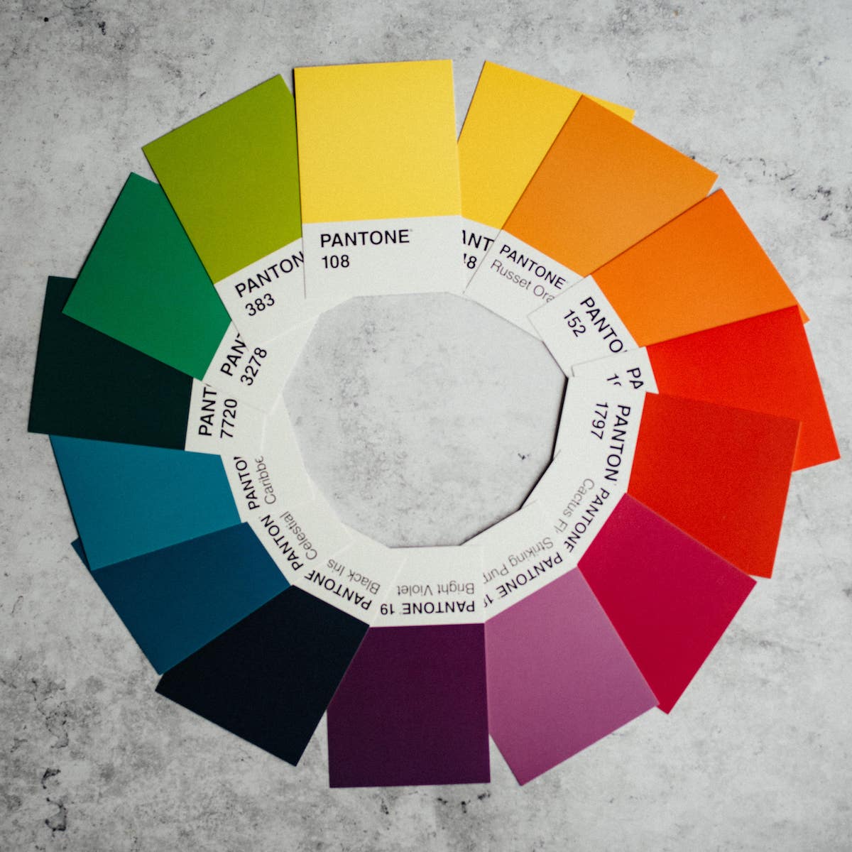
The color wheel
The color wheel is believed to be the birth of color theory when it was invented in 1666 by Sir Isaac Newton.
Yes, gravity wasn't the only valuable 'discovery' Newton made!
Newton created the color wheel to categorize colors because he understood colors as something we perceive as humans. The color wheel is split into three different groups: primary colors, Secondary colors & Tertiary colors.
1. Primary colors
You've probably heard of primary colors in school.
The three primary colors are red, blue and yellow.
They're called primary colors because they're the colors that are used to create every other color, essentially. You can compare them to prime numbers if you're a math head. There are just way fewer of them.
The three primary colors are used when making both secondary and tertiary colors. But more about that later.
The color wheel can separate warm colors from cool colors, which helps you when choosing colors in your design.
- Warm colors can symbolize things like energy and brightness.
- Cold colors can symbolize calm and peace.
They can also be used to relate to specific temperatures or climates, which is especially the case when colors are used as LUTs in movies.
- Here blue is typically something you use to symbolize cold, and red is generally used to represent hot.
- Red is associated with love, passion, fire, violence, importance, anger, and danger.
- Yellow is associated with happiness, sunshine, deceit, cowardice, hope, and relative danger.
- Blue is associated with sadness, calmness, responsibility, peace, and spirituality.
2. Secondary colors
Secondary colors are made up of the primary colors mixed. In the color wheel, the three secondary colors are green, purple, and orange.
- Green is associated with growth, renewal, abundance, jealousy/envy, balance, and harmony.
- Purple is associated with creativity, imagination, wealth, and luxury.
- Orange is associated with earth, autumn, creativity, change, health, and vitality.
3. Tertiary colors
Tertiary colors are made up of primary colors mixed with secondary colors.
On the color wheel, there are six tertiary colors: Red-Orange, Yellow-Orange, Yellow-Green, Blue-Green, Blue-Violet, and Red-Violet.

3 color harmony formulas
So now that you understand how the color wheel looks and works, how can we use it to our advantage?
One way to use it is to see which colors work in harmony. There are different ways to do that, but we've listed 3 of the most popular color harmony formulas.
1. Analogous colors
Analogous colors refer to the colors sitting right next to each other on the color wheel.
An example could be the warm colors mentioned earlier, such as orange, yellow, and red.
Here you would use similar colors or colors closely related to giving a specific feel. You would often use colors that share the same primary color, providing a form of harmony.
Using an analogous color scheme is also a great way to add greater detail to something without using the same color for everything.
Imagine if you were to do a photoshoot for an energy drink associated with the color green. It would get uncomfortable to look at an ad with a single green color. You could use different shades of green to retain the green color scheme but add some depth and accent.

2. Complementary colors
Complementary colors in color theory are straightforward to find if you have the color wheel right in front of you. That's because complementary colors essentially just mean opposite colors.
So to find any given complementary color scheme, you just have to find a color you want to use and look at the opposite end of the color scheme. And there you have it, your complementary color.
The reason these two colors work so well in harmony is because of the complete contrast that is created by using two opposites.
Let's go back to the energy drink example and consider if you're making a photoshoot to create a poster for your energy drink.
How can you ensure that it will catch people's eye when they're walking past it?
Consider using red, as it's a complementary color to green, and it creates a clear focal point for people looking at it.
3. Triadic
Lastly, we have the triadic color scheme, which manages to create a pleasant feeling while having contrasting colors.
It works by taking three colors equally distant on the color wheel. A great example of using a triadic color scheme is burger king, which uses Red, Yellow, and Blue in its company logo.
The color scheme always becomes very harmonious and maintains a contrast that makes it visually appealing.

Up next: Learn photography composition
I hope you learned how to approach creating a color scheme through classic color theory.
If you want to use your newfound knowledge about color theory in photography but still haven't gotten the hang of it, consider reading our article on photography composition.
About the instructor
Gabriel Kaunitz
Director
Columbus, Ohio, United States
Gabriel Kaunitz is a filmmaker, colorist, editor, and animator out of Columbus, Ohio. With almost 10 years of experience, he has worked with brands like O.A.R, Nationwide, and Velvet.
FAQs
What is color theory?
Color theory refers to the science (and art) of using colors.
What are the 3 basic color theories?
Color wheel, color harmony and context of colors.