Understand Colour in Cinema: Make Colour Part of the Story
Hire film gear from local filmmakers.
Hire film gear from local filmmakers.


Hi filmmaker, in this article, I'll guide you through the colours in cinema.
Understanding the meaning of colour in film is essential for taking your filmmaking process to the next level.
Colour is an effective way to elicit specific emotions or create certain moods in your movie, and using colours to create emotion is called colour theory in cinema.
And by creating a colour palette for your movie, you can help yourself tell a story, define a character, or create a reaction in your audience.
Why is colour in film important?
Well, the film colour theory is a theory that tells us that specific colours in film elicit certain emotions from the viewer.
So by using colours, the filmmaker can guide their audience towards feeling certain emotions.
You can use colours to evoke a mood or set the tone for a film - so using colour to your advantage is quite a powerful tool in telling your story. A well-designed movie colour palette evokes a mood and sets the tone for your film.
When choosing a colour, you also need to know that colours are separated into three components - hue, saturation and brightness, also known as value.
Hue is the colour itself. The primary colours are red, blue and yellow. Secondary colours are green, orange and purple, which are created by mixing the primary colours. Saturation is the intensity of the colour, controlled by how much grey is mixed into the colour.
Brightness/Value describes whether a colour is dark or light.
Darker colours have higher values – lighter colours, lower values.
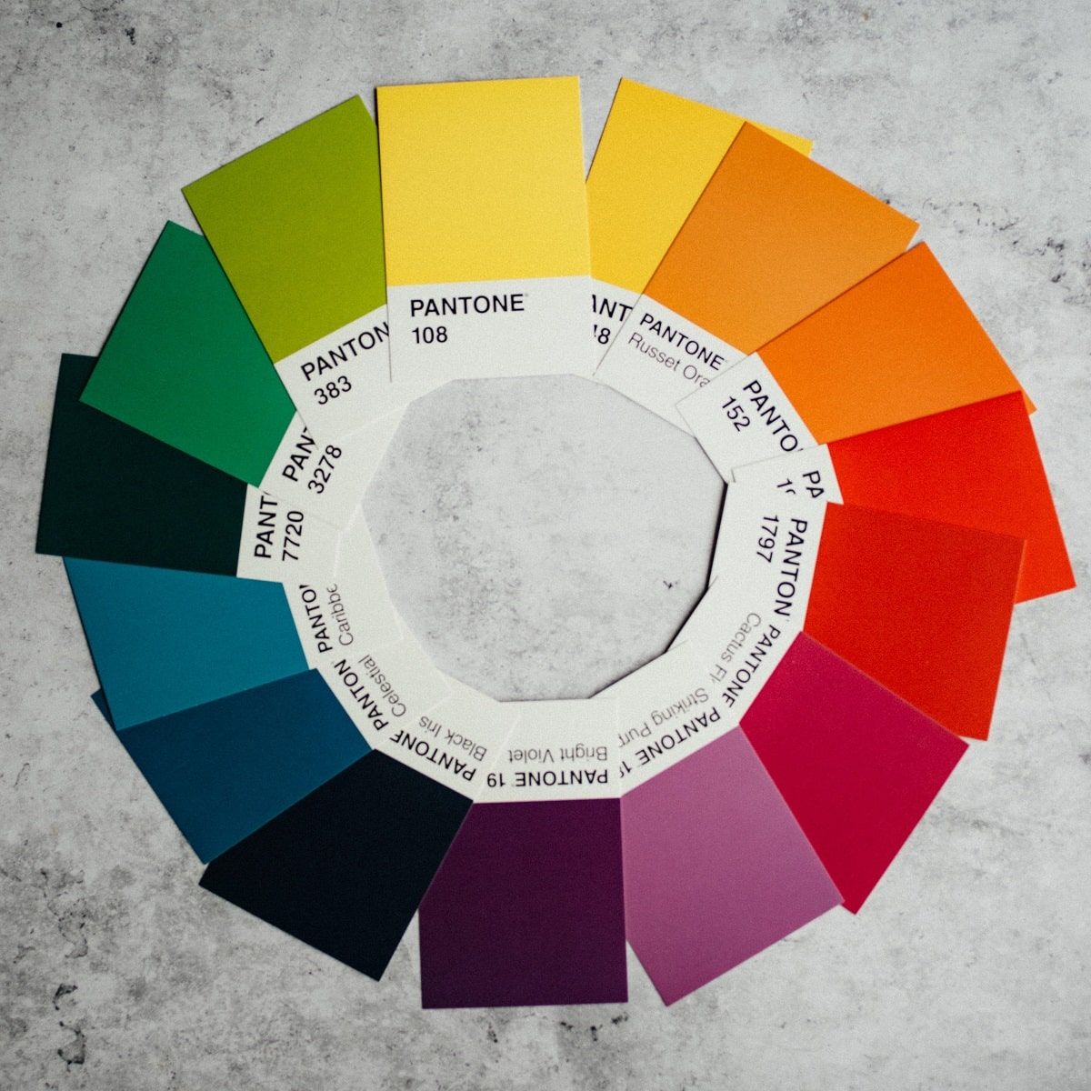
The colour wheel
When working with cinematic colour design, an essential tool is the colour wheel. The colour wheel is a circular tool showing the different colour hues and the relationship between the colours, and it is separated into primary, secondary and tertiary colours.
The primary colours are red, yellow, and blue, which can't be mixed by combining other colours.
The secondary colours are the result of the mixing of two primary colours. So the secondary colours are purple, orange and green.
The tertiary colours are the result of mixing primary and secondary colours next to each other. They include red-orange, yellow-orange, yellow-green, blue-green, blue-purple, and red-purple.
A colour palette should not be picked at random but should be carefully chosen based on the story you want to tell.
The first step is to learn about each colour when creating your colour palette.
What does each colour represent in cinema?
RED
In film, red is a colour of extremes. Red is the colour of love, passion, excitement, heat, desire, and violence, blood, danger, anger, and rage.
Red is one of the most visible colours and pulls the viewer's focus, hence why it is used as the colour of stop signs and firetrucks.
PINK
Pink is red and white combined. As such, pink is the colour of the softer aspects of love and is associated with innocence, sweetness, femininity, playfulness, beauty and empathy.
ORANGE
Orange is a very vibrant colour. In film, orange is the colour of warmth, friendliness, happiness, youth and the exotic.
YELLOW
Yellow is the most luminous colour and is very good at drawing attention. Yellow is the colour of madness, sickness, insecurity, idyl and naivety.
GREEN
Green is the primary colour of nature and is often associated with ecology. In film, green is the colour of nature, health, perseverance, but also of darker emotions like corruption, darkness and danger.
BLUE
Blue is another colour of nature, the colour of the sky and water, and blue is as cold as red is hot. In film, blue is the colour of cold, isolation, melancholy, cerebral, passivity and calmness.
PURPLE
Purple is the rarest colour in nature and has historically been associated with wealth and royalty due to the expensive purple dye. In film, purple is the colour of fantasy, the ethereal, mystical, ominous and eroticism.
Now that you know the traditional meaning of each colour, it's time to look at the different colour schemes you can use when creating your film colour palette.
Common film colour schemes
Now it's time to walk you through five of the most commonly used colour schemes when using colour in cinema.
Some films will stick with one reoccurring colour to create a primary theme throughout the film. However, you should always balance a film's colours, and the way to do this is by using complementary, analogous, triadic and tetradic colour palettes.
Monochromatic
Using a monochromatic colour palette is using a single base hue (colour) with different shades, tints and tones. Shades are darker, and tints are lighter.
Analogous
An analogous colour palette is three colours next to each other on the colour wheel.
The colour settings are made up of one primary colour, a supporting colour, and a third colour that mixes the two or an accent colour.
Complementary
A complementary colour palette consists of two colours opposite each other on the colour wheel and can represent conflict and offer high contrasts.
Triadic
A triadic colour palette is three colours equally spaced out on the colour wheel. One colour is dominant, and the other two are complementary
Tetradic
A tetradic colour palette is four colours equally spaced out on the colour wheel.
One colour is dominant, and the other three are complementary. The more colours you add to your palette, the harder it is to balance.
These are some of the ways of balancing your film's colour palette. Next is three quick examples of using the film colour palette.
3 Quick: How to choose a film colour palette
1. Use colour discordance to direct the audience
Using colour discordance is a solid colour to draw the viewer's attention towards an important character or prop. You basically force the viewer to look at a specific object, and you can do this by using a rich red colour against a white background.
2. Use complementary colour schemes to create striking images
You can create striking images by using the contrasts of the complementary colour scheme. It's the contrast between warm and cool colours that creates drama and life within your frame.
3. Use analogous colour schemes for satisfying images
If you want a pleasant feeling that pleases the eye, use analogous colour schemes. The lack of contrast creates visual unity and is often found in the nature around us.
Learn all the essential cinematography techniques
Using colour theory in your film is an excellent tool for creating moods and eliciting emotional responses from your audience.
Colour theory in cinematography is just a tiny part of enhancing your storytelling.
There are tons of cinematography elements and storytelling techniques essential to know when creating your perfect film.
Learn the different cinematography elements and storytelling techniques that will take your movie to the next level.
Colour in Film FAQ
Why is colour theory in film critical?
The colour theory helps you create the mood and tone of your film. It is an effective way of directing your audience's attention and eliciting emotional responses.
What are the 5 typical colour schemes in cinema?
- Monochromatic is using a single colour that permeates through your film.
- Analogous, a colour scheme of three colours next to each other that creates harmony.
- Complementary, two colours opposite each other, often used for contrasts.
- Triadic is three colours evenly spaced out on the colour wheel
- Tetradic four colours evenly spaced out.
Triadic and Tetradic are less common and can add a cartoonish element. Adding any more colours and it becomes challenging to balance your colour scheme.
Which colours cannot be mixed?
The three primary colours, red, yellow and blue, cannot be mixed into other colours.